- The Future Is Like Pie
- Posts
- The syntax of things
The syntax of things
The Future Is Like Pie #58
Lisa Maria Marquis
April 02, 2026
Don’t cry
— the best gesture of my brain is less than
your eyelids’ flutter which says
we are for each other: then
laugh, leaning back in my arms
for life’s not a paragraph
And death i think is no parenthesis
Happy April! I got mad at a website again! (Jump down to the recommended reading if you want to skip this little IA/product case study! The links this month are pretty choice, not gonna lie.)
Let’s look at Speks, maker of fancy fidgets, and their nice, clean website and its sparkling mess of information design. [Hey, listen: the night before I went to hit Send on this newsletter, Speks actually changed a bunch of stuff on their site. Most of this essay still stands, but, yeah, some things are different now. I can only assume Speks hates me personally and wants me to suffer.]
The main navigation starts with a Shop link:
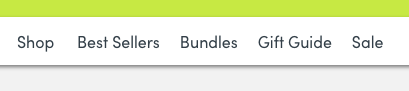
I would have expected it to take me to a landing page with all their product categories! Instead, it opens a dropdown:
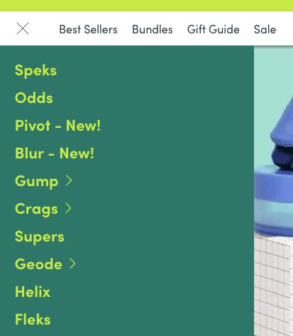
Ever since I was a little girl, I knew I wanted to shop for Gump.
Truly, I’ve never seen a better example of jargon product names. Jargon isn’t always technical or academic! Sometimes it’s meaningless nonsense. And I get it — goofy names are the brand! But unless you’re already incredibly familiar with this brand, there’s no way to know what any of this is. I don’t know what any of this is! What the hell is Pivot! What the hell are Fleks! And without a visual product page, there’s no way to teach me. The only way I can figure out what this company sells is by clicking on each product name individually. (Which I did! It took a long time.)
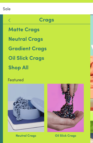
From this Shop menu, a few products have additional side menus to show off variants — like Crags, which are tiny pebble magnets (obviously, of course, how could you not know that). Their side menu reveals options for Matte Crags, Neutral Crags, Gradient Crags, Oil Slick Crags, and a Shop All link, as well as visual cards for Neutral Crags and Oil Slick Crags:
Remember that band, Neutral Crags? I love shoegaze.
The visual cards are my first look at what Crags actually are, and I can surmise from this menu that the product is organized by color types, or maybe finishes? Matte is a texture, neutral is a palette, gradient is a range, and oil slick is a color (or four). Shruggy emoji!
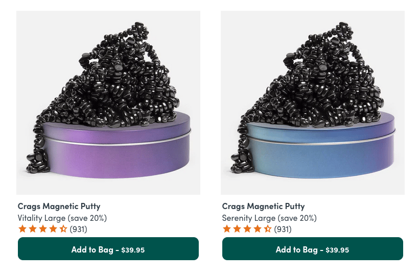
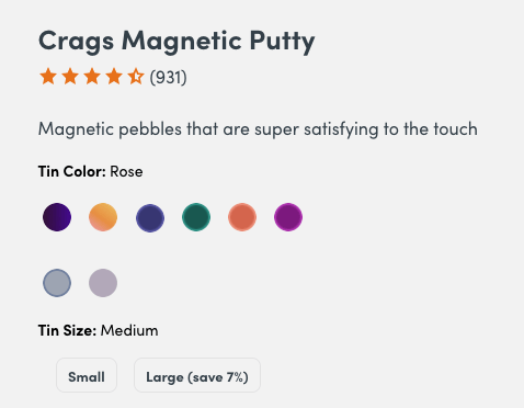
When I click on Shop All, I get to a Crags landing page (finally!), but frustratingly, I immediately notice that none of the finish categories I just saw on the dropdown menu are part of the product listings. Instead, I get labels that blend color names and sizes, like Harmony Small! Dandy Medium! Vitality Large!
Are these Neutral or Gradient?
It’s not all unclear — light pink Crags are labeled Rose, bright orange are Coral, and Oil Slick is easy enough to identify— but nothing connects them to the dropdown categories. I don’t see anything that I would call Gradient, and when I click on the Matte and Neutral categories in the dropdown, they both go to the same page:
Dandy is yellow, in case you were wondering.
In the product page, the colors are explicitly mapped to “Tin Color,” even though many (like the aforementioned Rose, Coral, and Oil Slick) apply to both the tins and their pebbles. But the non-color colors — Dandy, Serenity, Tranquility, and Vitality (color naming is a different rant we don’t have time for right now) — only appear to alter the color of the tin, while the pebbles stay the same. Want a different color of pebbles? Change size! Small will get you shiny hematite-colored pebbles, while medium gets you black (and large looks like a cross between the two — unless the differences are just poor photography). What are we doing
I could not figure out how to get the pebble color and size combo that I wanted, because none of the labels matched how I expected product color and sizing to work. And while it’s the sloppy information architecture of it all that calls out to me, it’s really a failure of product design. The way this company conceptualizes their products is disorganized, and that disorganization bleeds through into how the products are categorized, labeled, and displayed on the site. What we, as users, get is:
Restricted browsability
Meaningless product names (and color descriptors)
Inconsistent categorization from screen to screen
Conflation of size and color as a single organizing principle
— all things that should be addressed first by how product information is treated and documented internally, then by how that information is structured and designed for users. This is the result of a product team that is either hyper-siloed or deeply underresourced (or both) — and definitely missing someone responsible for thinking about the experience as a system.
Despite all that, I did end up buying some Odds — the need for chunky dodecagon magnets is more powerful than UX frustration. Capitalism wins again!
Good writing
“I think you should understand that most things in this world are neutral.” [tumblr]
“But for these norms to stick they have to have some teeth. And that means you have to at some point refuse.” [Mandy Brown]
“coding agents, which require constant attention and often generate low-quality code with (by design) random results, are a slot machine. […] you have a gambling addiction.” [Jae Kaplan]
“Am I the circus?” [Brian David Gilbert]
Tools and games
It’s easy to forget that the average person probably only knows one or two XKCD comics [XKCD 2501 Generator]
Add your own text to classic game screens [Alice Averlong]
List as many animals as you can [Vivian Rose]
Make 45 categories of 45 things [Thomas Colthurst]
Very cool mockup tool made out of ASCII [Mike Bespalov]
April’s cause
The Trans Continental Pipeline is a nonprofit helping trans folks relocate to Colorado from states with unsafe policies (a number that seems to be increasing daily). Let’s send some money to TCP and save some lives!
I’d nearly forgotten that this lovely unofficial directory of former-ABA books exists — and I’m a part of it! Heck! So I’m reminding all of us that it’s a great little site to find some of the smartest writing in the tech industry. Go! Now! Buy some books! Buy my book! (And big thanks again to David Demaree for designing such a great little home for the authors!)